Perhaps you are running into issues with muted color in your documents or your printed materials are not as bright as you designed them. Maybe you’re frustrated because the colors on your documents don’t look like they did on your monitor. You’re wondering why your prints look the way they do.
The intent of this article is to convey the importance of a basic understanding of the reproduction of color.
What is Color?
We all have a basic grasp of color as we see it. We often don’t consider how color is created in order to provide the visual effect.
General Answer: Color is what we use to add clarity and interest to our communications.
Technical Answer: Color is a mathematical equation to reproduce a desired result with an output device.
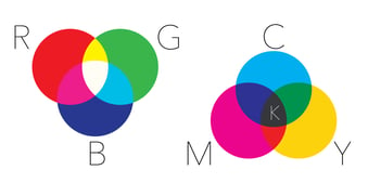
Display color is created with light, while printed colors are created using ink or toner combinations. Display and print use different color models to achieve the desired hues and tones.
We use RGB for display and we use CMYK for print.
Understanding the purpose of different color models helps show why using one over the other is a limiting factor.
RGB vs CMYK
 RGB stands for red, green, blue — the are the primary light colors used for display. Display screens use a combination of these lights to produce a wide range of colors. Output devices using RGB models include monitors, phones, televisions, and billboards.
So, if you are creating web-only graphics, you will want to use an RGB color profile.
Pro tip: Microsoft applications such as Word, Powerpoint and Excel use RGB as their color model. If you use a Microsoft product to create printed materials the colors will most likely not look like what you see on screen when printed.
CMYK stands for cyan, magenta, yellow and key (black) — A printer uses dots of ink or toner to make up the image from these four colors. 'Key' actually means black. It's called Key because it's the main color used to determine the image outcome.
When designing for print, the colors on your screen will never have the same visual appearance as the printed material. This is why print professionals always say to “proof to your output” (or print a test copy before a full run).
Pro tip: There are ways to use RGB colors and have them print accurately on a print device. You would need to add a digital front end to your print device that is engineered to do this. Some examples would be Fiery, Creo and Heidleberg. All of these products do a very good job of interpolating RGB into CMYK, though they will never be a perfect match and do not increase the color gamut of a printed device.
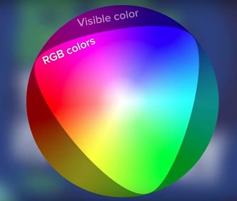
Here you can see that if you design using an RGB color gamut, there is a high likelihood of you coming up with colors that cannot be reproduced on a print device. Further, digital front ends that help with this disparity do not make a print device print RGB. It does a good job of creating the math to shorten the distance from the original RGB color.
Frequently Asked Questions About Workplace Printing
Every print costs money, meaning you want to get it right without a lot of trial runs. Here are some of the most common questions we get asked about office printers and print jobs for the workplace.
 Why does the color that I print not look like what I expected?
There are several reasons for this. Let’s knock out a few of the easy ones right off the bat.
Your PCL Driver: If you are printing to a desktop printer or an office copier, determine if you are using a PCL or Postscript driver. You must use a Postscript driver to print accurate color. You can achieve pleasing color with a PCL driver, but you will never achieve consistent color. Accurate color can only be attained through a postscript driver and a calibrated print device. There are also different levels of calibration outside the scope of this article, which I will discuss later in this series.
Program Limitations: The next biggest hurdle to overcome is to determine if the application you are using for design allows for color management. This means that it understands ICC color profiles. ICC profiles can be complicated — but just know that using an application that does not support color management does not mean that you cannot print acceptable color, it just may differ from what’s on your monitor.
Using RGB Color Pickers: Some programs, like Gimp and Canva, don’t have native CMYK color profiles. When you choose a color on these programs, you may choose one that cannot be reproduced with CMYK.
How does image quality affect color?
Let’s briefly talk about image quality, another factor that leads to incorrect color. There are three main factors to quality that will impact printing:
- Image size (pixels, file size, dpi)
- Image type (raster or vector)
- File type (jpeg, bitmap or source image)
Do not ever use a company logo (or any other artwork) that is a screen capture from the internet. Everyone has done it, but it’s bad practice.
When you need to get a printed piece out the door, this is what happens: no one has the original art and we don’t have time to go to the source and get the proper artwork. Therefore, we output less than desirable collateral by snagging a screen capture or saving a Google result.
From a technical standpoint, there is little that can be done to improve the print quality of a screenshot image.
Everything that you screen capture is a bitmap, also referred to as a raster. This is an image that consists of a set number of pixels. For internet display, images are compressed to 72 dpi (dots per inch) to enable fast uploading.
Yet, print quality is 300 dpi. You can already see the disparity. This is why the image will always look fuzzy — there aren’t enough dots for print!
Most people will click and drag this to enlarge it, pixelating the image further. When it’s printed at a larger size, the number of pixels (dots) don’t increase, only the size of the pixels.
This will also change the color. If you enlarge it the color will become lighter, when you reduce it the color gets darker. This is because you are either stretching the pixels further apart creating white space or you are placing pixels on top of each other creating more density within a color.
In this situation, there is nothing you can do besides create new artwork. It will never be the correct size.
As explained above, the color profile of everything on the internet is RGB. This is because the intent of the internet is to be seen on a screen. All display devices use light therefore RGB is the preferred color workspace. This means that when you go to print it is converted to process color (CMYK). So, it will never look like the color you see on the website.
Pro tips: Make certain you understand the source of your image. Is it a Raster image or a Vector graphic? They should be created and edited differently and there are specific applications for each.
When producing printed collateral, you will always want the source image. If someone provides you a jpeg, that is not the source image. A jpeg is the compressed version of the original artwork or image. For optimal results, you should always work from tiff, eps or source application files, such as the Adobe suite. Your product will look professional and pleasing to all.
Find Printing Solutions for the Best In-House Results
This is the first in a series of articles on color. If you need someone who listens to your printing needs and helps find solutions, UBEO Business Services is your partner.
Steven Van Liew
Steven Van Liew is a leading systems engineer in the world of production print. Steven is a certified G7 expert and has over 20 years in production print, IT, and workflow solutions.


